Meridian
Redesigning a wealth management platform for the next generation of investors.

Fintech · Product Design · 2024
Meridian is a next-generation wealth management platform designed for a generation of investors who grew up with smartphones but are now navigating serious financial decisions for the first time. The brief: make institutional-grade investment tools feel human.
The challenge
The previous product had been built by engineers for engineers. It was technically impressive but emotionally alienating — a wall of charts, tables, and jargon that communicated capability while failing to build trust. Users reported feeling confused and anxious when using it. That is not the feeling you want from a product managing someone's financial future.
The approach
Research & reframing
12 weeks of contextual interviews with investors aged 25–40. We mapped not just their tasks but their anxieties — the moments where financial products made them feel stupid or exposed.
Information architecture
Rebuilt the entire navigation and data model from scratch, prioritising the questions users actually ask over the data the company wanted to show.
Design system
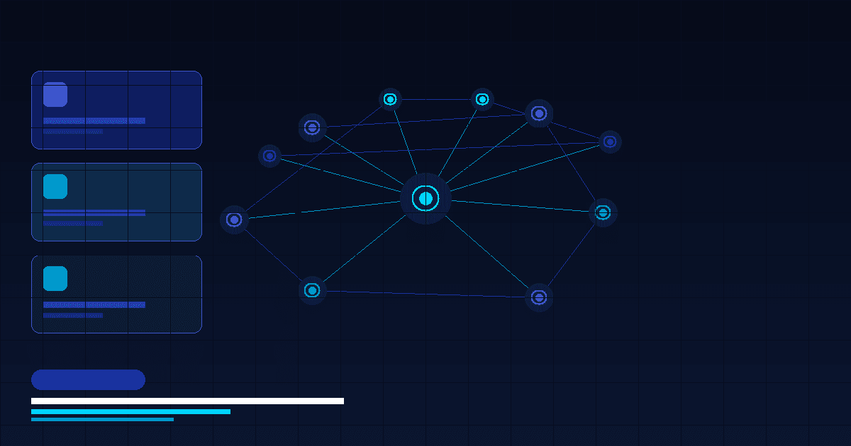
Created a new component library with financial data patterns at its core — data visualisation, contextual tooltips, and confidence indicators that made complex information feel manageable.
Testing and refinement
Five rounds of usability testing across the full journey, from onboarding to first investment. Iterated relentlessly on the moments that generated the most anxiety.
Outcomes
Six months after launch, average session time increased from 3.1 to 8.4 minutes. First-time investment completion rose by 67%. NPS moved from 31 to 71. But the metric I am most proud of: user anxiety scores (measured via survey) dropped by 44%. The product started to feel safe.